5 GIS Example
This chapter looks at some GIS work I did for a research project in progress. To investigate the question of whether a politician’s margin of victory is related to pollution outcomes I assemble a dataset combining data from EPA pollution monitors, election results, congressional district boundaries, county level variables, weather data and matching them together by geography
5.1 MIT Election Data
Data on U.S. House elections from 1976-2016 is obtained from MIT’s Election Data and Science Lab. The data contains the name of candidates running in a US House election, the state and district they are running in, their party affiliation, if they were a write in candidate, how many votes they received, how many votes were cast in the election overall, and if the election was a special or regular election.
From this data allows me to define incumbency variables grouping incumbents into the number of terms they served. Since this data spans back to only 1976, any incumbency measure is based on 1976 as a starting point. Thus if I wanted to group incumbents serving 3 terms, I would check which politicians served in three previous terms. For example, in 1980 I would see if a given victorious politician had also won elections in 1976 and 1978. If they had I would categorize them as a 3 term Representative. Should I want to group 5 term incumbents, I would not be able to to this in 1980 since I would need data going back to 1972. In some cases in my analysis I will have to drop some pollution observations at the beginning of my sample for this reason.
I also calculate the margin of victory from this data defined as the difference in votes of the top two candidates divided by the sum of the top two. For example consider a race of three candidates, a Republican victor who has 45% of the vote, a Democrat who wins 40% of the vote, and an Independent who wins the remaining 15% of the vote. Calculating the margin of victory would give us:
\[ \frac{0.45 - 0.40}{0.45 + 0.40} \approx 0.0588 \]
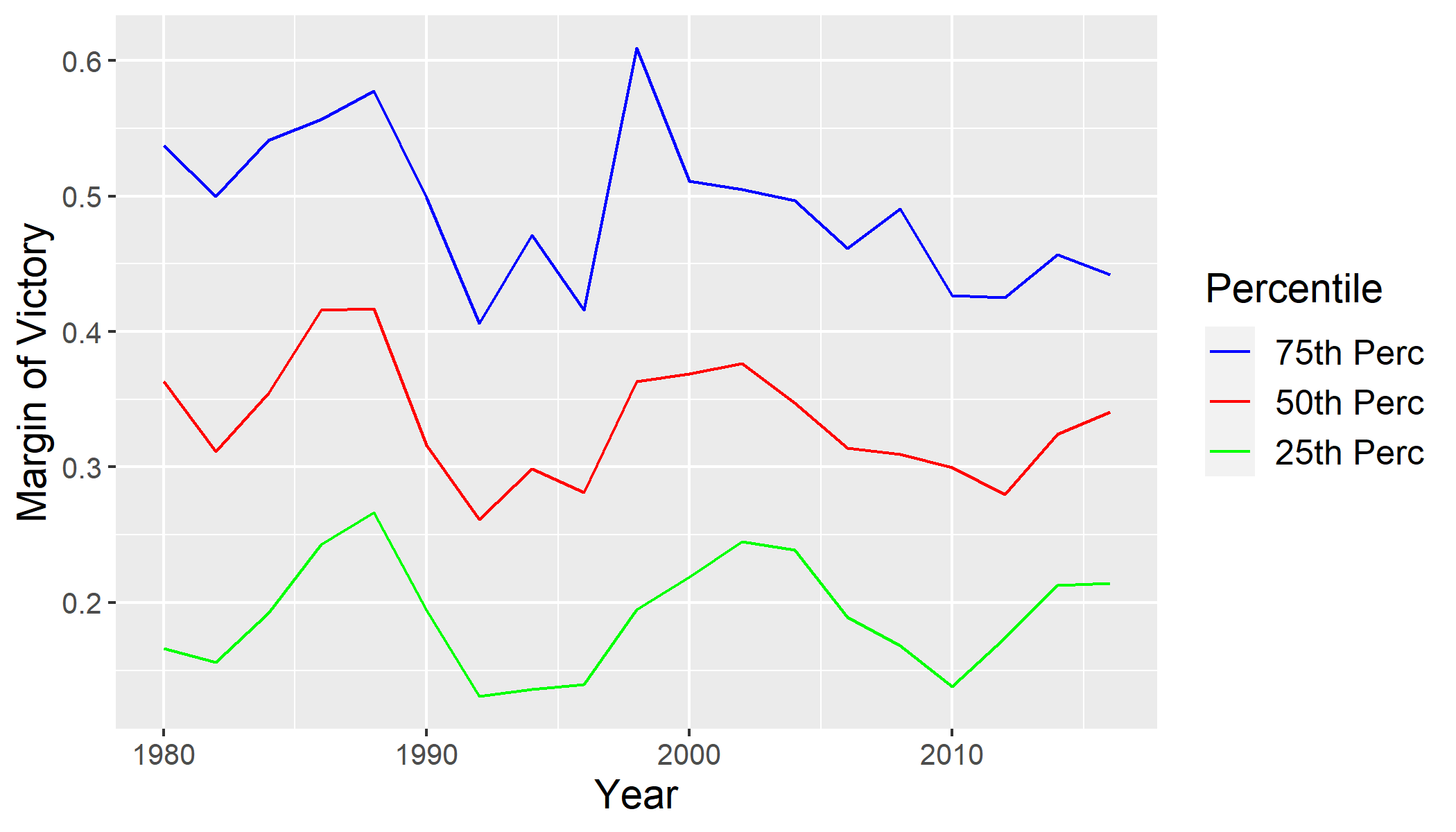
Results of elections are matched to pollution monitors through mapping the monitors into congressional districts and then attributing monitors to districts which politicians represent. Historic district boundary shapefiles are obtained from the website of Lewis et al (2013). These maps allow me to overlay the pollution monitor’s latitude and longitude coordinates, obtaining which district each monitor is located. Example of boundaries for the 110th congress (contiguous US) below.

5.2 Pollution Data
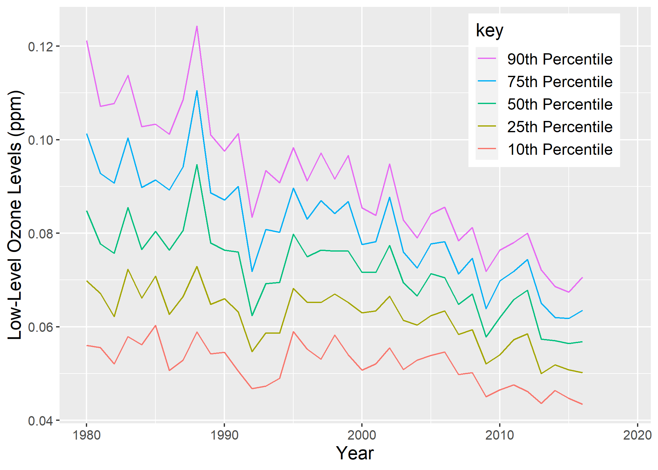
Ozone pollution data is obtained from the EPA’s website on Air Quality at the daily frequency. Monitors collect observations through the course of the day on the parts per million of ground level ozone, they are then averaged by consecutive 8-hour readings. I utilize the maximum 8-hour reading for each day, restricting my sample to reliable monitors within the month defined as having more than 25 day readings within July. I then average the top 5 days within the month of July. Below I illustrate percentiles.
5.3 BLS County Statistics
Data on yearly population, personal income, and employment data at the county level were obtained from the Bureau of Economic Analysis. Utilizing this data in combination with county shapefiles from the Census Bureau allowed me to calculate a population density for each county.

5.4 Combining Data
Pollution monitors are a point in space while congressional districts and counties are an area. Hence we will map these points into both of these boundaries. In the below image I illustrate this: the colored areas represent counties, the dark boundaries represent congressional districts, and the points are pollution monitor locations.